Bi-weekly Critique

festival poster critique

dfsdf

Title: Camera Japan Festival 2011

Author: camera japan

Year Produced: 2011

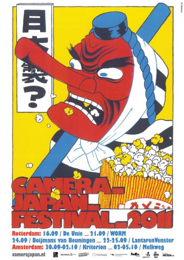
While I was searching for festival posters, this colourful poster caught my eye because of the expressive character and nice layout. The character is wearing a red tengu (heavenly dog) mask that is diagonal to the caption ‘Camera_ film_ festival_ 2011’. So when someone looks at the poster they are first drawn to the bright red, odd character and then follow over to the title. The colour scheme is very bold (red, blue, yellow, black, white) this acts to contrast the poster very strongly.

The dynamic layers give the poster a lot of action, popcorn spilling out everywhere and the character is not locked into the frame with his staff slightly out of the frame. The font is quite playful due to its bubbly overlapping nature and has a subtle drop shadow which adds a bit more depth to the poster.

Overall I really enjoy looking at this poster and appreciating the Japanese humour and simple design style.

Standard
Bi-weekly Critique

Identity Critique

digimon-logo


Title: Digimon: Digital Monsters (デジモン)

Author: Bandai

Year Produced: 1997

(Focusing on the Digimon logo and not the Bandai logo above it) I really like this logo not just because of the nostalgia surrounding it but because it is well designed and is very bold and stylish. The typeface is a sketch style that leaves something to the imagination; I like to think they are claw marks from rampant monsters in the middle of a fight. The ‘O’ is a very stylish monster head that acts to balance the large space in the ‘D’. The sizing of the letters in ‘Digi’ get small towards the end to give the ‘M’ more power.

Some might think this logo is a bit too rough or sketchy and may even say it is bad, I think the opposite; this logo is bold, simple and incredibly stylish.

Standard
Bi-weekly Critique

Print advertisement – Jaws movie poster

Jaws-movie-poster


Type: movie poster

Author: Seiniger Advertising agency with artist Roger Kastel

Year: 1975

While searching for movie posters one that caught my eye was Jaws. This poster is terrifying to say the least. It features an incredibly huge shark approaching a lone female swimmer. The shark blends into the water with bubbles showing vertical movement and above that is the surface contrasted with white and the quite large movie title. The shark is facing upwards showing its power while the woman is sideways unaware of what is below creating suspense. The movie’s title at the top is bold red representing that it is a bloody and gory movie. The poster uses three main colours; red blue and white, a strong colour scheme.

This posters simple layout and amazing artwork work perfectly in showing what type of movie the audience can expect.

Standard
Bi-weekly Critique

Phone app – Tripview (Travel App)

Phone app – Tripview (Travel App)

Price: $2.99

Platforms (iOS & Android)

Author: Grofsoft (2008)

unnamed

“TripView displays Sydney Train/Bus/Ferry timetable data on your phone. It features a summary view showing your next services, as well as a full timetable viewer. All timetable data is stored on your phone, so it can be used offline.” ……….Itunes

Tripview at its core was designed to be easy to use presented by its simple design and layer like navigation. Tripview uses different colours to separate options and routes. The layout is very simple, when the app is launched users are presented with a plus button, then options for train, buses and ferries are given. This layout is very effective because only the necessary functions are shown. Tripview uses a sans serif font with variations in size and color to represent important and minor details.

Overall Tripview is an excellent app because of its ease of use and simple attractive layout.

Standard
Bi-weekly Critique

Wesbite – Design by Humans

Website – design by humans (http://www.designbyhumans.com/)

Founded: Irvine, California (2007)

Type: shopping, design community

design by humans

The design by human’s website is attractive, easy to use and has some cool stuff on it. The website mainly uses the ‘colors’ black and white complemented by small touches of blue, red and orange, this works very well. Basic fonts are used which makes the website easy to read.

Design by humans uses an almost generic layout, tabs can be found on the top of the site (gallery, submit, our story, etc…) with the shopping cart, logo and search bar. Scroll a little lower and you can find a slideshow with a pull out menu which is quite nifty. The only thing I find bad about the site is sometimes I don’t know where I am or where I am going as some sections have too much information on them.

In conclusion design by humans is an effective and appealing website with only few minor issues.

Standard
Bi-weekly Critique

Packaging – iPhone 3Gs box

Author:  Steve Jobs, Jonathan Ive and many other designers for Apple.

Year Produced: June 19, 2009

Type: Phone box

iphone-3gs-box iphone-box_patent_open


The iPhone 3gs box serves as an excellent way to package the phone because it is iconic in its design. The box is black with a picture of an iPhone on the top representing what is inside and has various branding around the edges again emphasizing what the product is. The inside of the box is very innovative as the consumer opens the box they are introduced to the product in layers, the phone being the most important thing is on top and information and accessories are beneath. The box is easy to open and has the ability to be repackaged with out damaging the box.

The simple black and white color scheme gives a sophisticated feeling about the product and represents the black and white color scheme of the iphone itself. The only type present is the iPhone logo on the sides of the box that uses a very basic font that works well with the box because it is simple. In conclusion all the design choices that went into the iPhone box work very well together because they all share the common theme of simplicity and the idea to show only what is important.

Standard