


festival poster critique
Title: Camera Japan Festival 2011
Author: camera japan
Year Produced: 2011
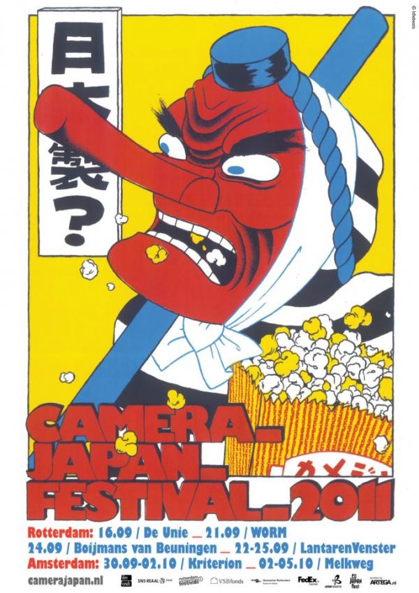
While I was searching for festival posters, this colourful poster caught my eye because of the expressive character and nice layout. The character is wearing a red tengu (heavenly dog) mask that is diagonal to the caption ‘Camera_ film_ festival_ 2011’. So when someone looks at the poster they are first drawn to the bright red, odd character and then follow over to the title. The colour scheme is very bold (red, blue, yellow, black, white) this acts to contrast the poster very strongly.
The dynamic layers give the poster a lot of action, popcorn spilling out everywhere and the character is not locked into the frame with his staff slightly out of the frame. The font is quite playful due to its bubbly overlapping nature and has a subtle drop shadow which adds a bit more depth to the poster.
Overall I really enjoy looking at this poster and appreciating the Japanese humour and simple design style.
Identity Critique
![]()
Title: Digimon: Digital Monsters (デジモン)
Author: Bandai
Year Produced: 1997
(Focusing on the Digimon logo and not the Bandai logo above it) I really like this logo not just because of the nostalgia surrounding it but because it is well designed and is very bold and stylish. The typeface is a sketch style that leaves something to the imagination; I like to think they are claw marks from rampant monsters in the middle of a fight. The ‘O’ is a very stylish monster head that acts to balance the large space in the ‘D’. The sizing of the letters in ‘Digi’ get small towards the end to give the ‘M’ more power.
Some might think this logo is a bit too rough or sketchy and may even say it is bad, I think the opposite; this logo is bold, simple and incredibly stylish.


